Default Template Modules (TEST)
Default Template modules are used to display content within the body of a full-width page template.
There are more than twenty modules available when using the full-width “Default Template” for a web page. Many of the modules have additional display options that allow for further customization.
WYSIWYG Module
The “What You See Is What You Get” module is the most often used content module available. It’s functionality is similar to using Microsoft Word or other text editing applications. It allows for free-form content creation. Styles are preset to maintain consistency with Mercer’s branding guidelines.
Code Module
This module allows for the entry of html or other types of code on a web page. Please do not use this module unless you are familiar with code development. If you have any questions, please contact the Digital Communications team.

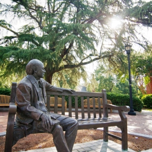
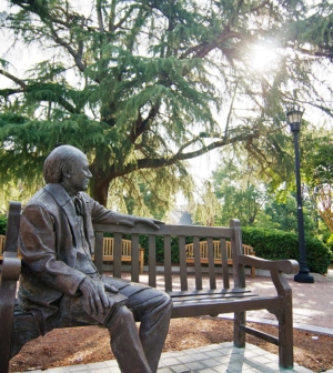
Block Content Module
This module can be used to present a group of related items. Each block consists of individual rows, alternating sides as items are added. In addition, the color element should be different from block to block.

Second Item
For the second item, the content and photo switch sides.
Primary Title
Block Caption Module
This module is used to highlight a topic as well as a specific subject within the topic. The main topic should be featured in the white space and the secondary subject content should be featured within the photo block overlay.
Block Orange Background Full Module
This module is used to highlight and emphasize content. The vibrant background color allows it to stand out to ensure your content is prominent and easy to find.
Block Featured Module
This module is used to highlight content. It can be used to present information in a visually compelling way to emphasize hierarchy and interest. Authors can choose between light and dark background color options, depending on their design needs.
Block Media Full Module - Static
This module is used to highlight content. It uses a bold, full-width background image with an overlaid content box.
Block Media Full Module - Carousel
This module is used to highlight multiple items of content using a carousel design feature.
Block Media Full Module - Carousel
This module is used to highlight multiple items of content using a carousel design feature.
Block Media Full Module - Carousel
This module is used to highlight multiple items of content using a carousel design feature.
Block Media Full Module - Carousel
This module is used to highlight multiple items of content using a carousel design feature.
Primary Title
Block Stories Module
Story Title
Story Subtitle
This module is used to highlight impact stories. This module shows one impact story that the user can navigate to as well as an optional link to view all impact stories.
Story Title
Story Subtitle
This module is used to highlight impact stories. This module shows one impact story that the user can navigate to as well as an optional link to view all impact stories.
Story Title
Story Subtitle
This module is used to highlight impact stories. This module shows one impact story that the user can navigate to as well as an optional link to view all impact stories.
Story Title
Story Subtitle
This module is used to highlight impact stories. This module shows one impact story that the user can navigate to as well as an optional link to view all impact stories.
Primary Title
Block Content Group Module
This module is used to highlight a group of related items in large blocks. It shows items using blocks, each with a call-to-action link. The layout can accommodate two to four blocks.
Item Title
Lorem ipsum dolor sit amet, consectetur adipiscing elit. Nunc fermentum odio eu est ornare egestas non a augue. Suspendisse tincidunt tellus in mi porttitor, posuere vestibulum dui blandit.
Item Title
Lorem ipsum dolor sit amet, consectetur adipiscing elit. Nunc fermentum odio eu est ornare egestas non a augue. Suspendisse tincidunt tellus in mi porttitor, posuere vestibulum dui blandit.

Grid Display
Block Cards Module
This module is used to highlight a group of items in small cards. This module shows items through cards with up to two call-to-action links each. This module can either be a grid of cards (minimum of four and maximum of twelve) or a carousel of cards. The carousel of cards will infinitely loop. It is often used to showcase people.

Title
Lorem ipsum dolor sit amet, consectetur adipiscing elit. Nunc fermentum odio eu est ornare egestas non a augue.
Title
Lorem ipsum dolor sit amet, consectetur adipiscing elit. Nunc fermentum odio eu est ornare egestas non a augue.
Title
Lorem ipsum dolor sit amet, consectetur adipiscing elit. Nunc fermentum odio eu est ornare egestas non a augue.
Title
Lorem ipsum dolor sit amet, consectetur adipiscing elit. Nunc fermentum odio eu est ornare egestas non a augue.
Title
Lorem ipsum dolor sit amet, consectetur adipiscing elit. Nunc fermentum odio eu est ornare egestas non a augue.
Title
Lorem ipsum dolor sit amet, consectetur adipiscing elit. Nunc fermentum odio eu est ornare egestas non a augue.
Title
Lorem ipsum dolor sit amet, consectetur adipiscing elit. Nunc fermentum odio eu est ornare egestas non a augue.
Title
Lorem ipsum dolor sit amet, consectetur adipiscing elit. Nunc fermentum odio eu est ornare egestas non a augue.
Carousel Display
Block Cards Module
This module is used to highlight a group of items in small cards. This module shows items through cards with up to two call-to-action links each. This module can either be a grid of cards (minimum of four and maximum of twelve) or a carousel of cards. The carousel of cards will infinitely loop. It is often used to showcase people.
Title
Lorem ipsum dolor sit amet, consectetur adipiscing elit. Nunc fermentum odio eu est ornare egestas non a augue.
Title
Lorem ipsum dolor sit amet, consectetur adipiscing elit. Nunc fermentum odio eu est ornare egestas non a augue.
Title
Lorem ipsum dolor sit amet, consectetur adipiscing elit. Nunc fermentum odio eu est ornare egestas non a augue.
Title
Lorem ipsum dolor sit amet, consectetur adipiscing elit. Nunc fermentum odio eu est ornare egestas non a augue.
Title
Lorem ipsum dolor sit amet, consectetur adipiscing elit. Nunc fermentum odio eu est ornare egestas non a augue.
Title
Lorem ipsum dolor sit amet, consectetur adipiscing elit. Nunc fermentum odio eu est ornare egestas non a augue.
Title
Lorem ipsum dolor sit amet, consectetur adipiscing elit. Nunc fermentum odio eu est ornare egestas non a augue.
Title
Lorem ipsum dolor sit amet, consectetur adipiscing elit. Nunc fermentum odio eu est ornare egestas non a augue.
Block Callout Module
This module used to highlight a group of related pictures in a cluster. It contains a main content block to feature a topic and a cluster of three images.
Primary Title
Block Text Module
Item Title
Item Title
Item Title
Item Title
Primary Title
Countdown Clock Module
This module promotes a single event with a countdown of days, hours, minutes and seconds. An optional link to the event can be added. The background image can also be customized.
Days
Hours
Minutes
Seconds
Primary Title
Statistics Module
This module displays statistical information and details about the data, which can link to another location if desired. It is available in "small" or "large" design formats.
Overlay Version
Student Stories Module
This module highlights student stories using two configurable layout options: "Overlay" or "Popout". Authors can choose between "light" and "dark" background color options, depending on their design needs.
Popout Version
Student Stories Module
This module highlights student stories using two configurable layout options: "Overlay" or "Popout". Authors can choose between "light" and "dark" background color options, depending on their design needs.
This is the Quote Module. It can be used to highlight a quote for visual prominence. Authors can add a photo and additional text using the extended pop-out option.
Primary Title
Events Module
Research Seminar Series: Dr. Juliane Nguyen
3:00pm - 4:00pm
ZOOM
Faculty & Staff
The Career Den: Professional Pathways Group
7:00pm - 8:00pm
Online
Student
IMWE x Z Beans Back to School Brews
9:00am - 12:00pm
Cruz Plaza
Student
MU Motion Moves Dance Classes
6:00pm - 7:00pm
Fitness Center Meeting Room
Student
Pickleball Club
6:30pm - 8:00pm
Tattnall Pickleball Center
Student
Delight Weekly Meeting
7:30pm - 8:30pm
Newton Chapel
Student
Still Small Voice
10:00am - 10:30am
Online
Faculty & Staff
Fresh Check Day
4:00pm - 6:00pm
Cruz Plaza
Student
Reformed University Fellowship (RUF) Wednesday Night Large Group
8:00pm - 9:30pm
Penfield Hall
Student
Sandwich Making
11:00am - 12:00pm
Centenary United Methodist Church
Student
Shalom Mercer Meeting
6:00pm - 7:00pm
Knight Hall, Room 108
Student
Pickleball Club
6:30pm - 8:00pm
Tattnall Pickleball Center
Student
Primary Title
News Module

People
Professor gives students hands-on legal experience through domestic violence clinic

People
Former Goldwater Scholar a chemical researcher for U.S. Department of Agriculture

People
Mercer professor fosters engagement among students, faculty
Mercer News
Tift College of Education graduate students chosen for GDOT Instructional Designer Internship Program
Discovery and Innovation
Cookstove project provides students with new perspective on engineering
Health and Wellness
Deep roots, strong communities: Farm Stress Summit focuses on mental health challenges in Georgia’s rural farmers

People
Mercer senior wants to inspire leadership, resilience in others
Viewpoints
Pick up life’s pieces and mold them into something new | Dr. Craig McMahan
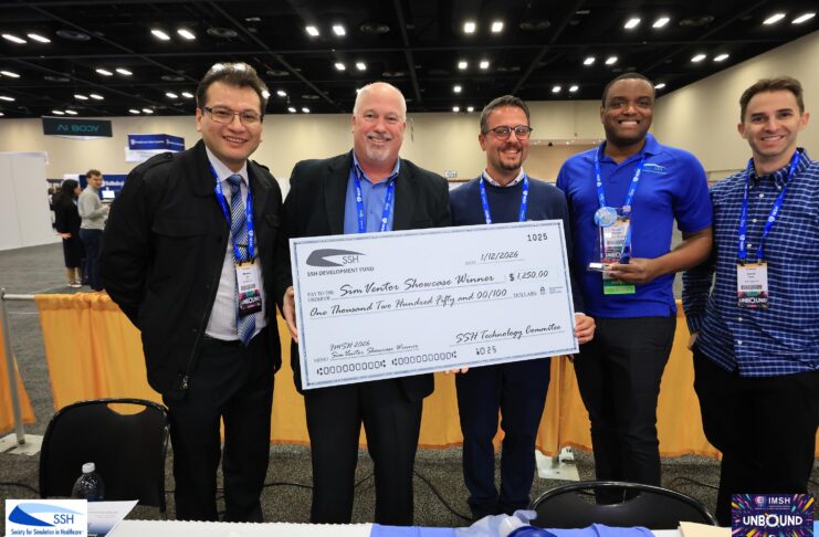
Discovery and Innovation
Mercer simulation devices aim to fill need in rural medical training
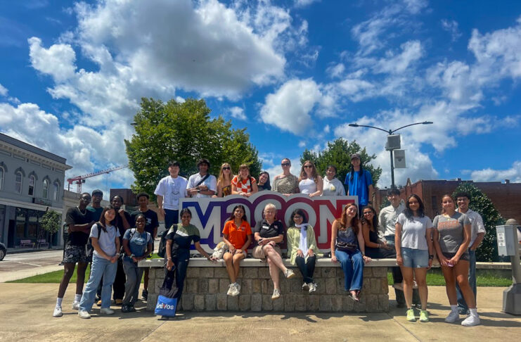
Life at Mercer
New mentorship program provides international students with extra support
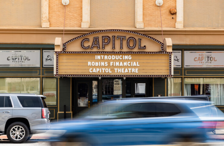
Mercer News
Mercer acquires downtown Macon’s historic Capitol Theatre

Mercer News
Sophomore awarded Fulbright Canada-Mitacs Globalink Research Internship
Primary Title
Image Carousel/Grid Module